JAWARA

Jawara creative direction
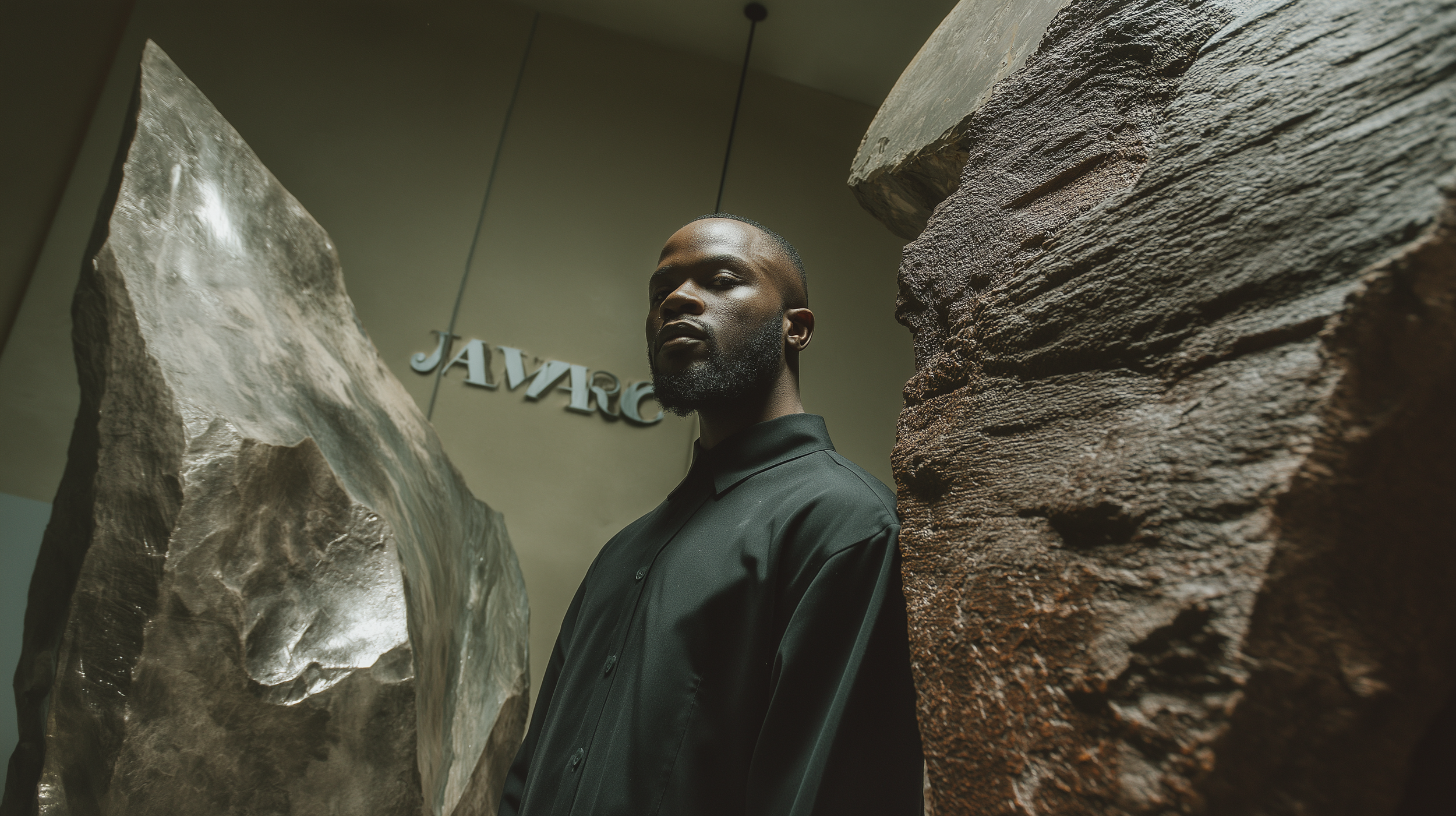
The creative direction for Jawara was conceived as a total environment in which identity, product, space, ritual, and image operate as a single system. Rather than approaching the project as a conventional salon brand with an interior attached to it, the concept treats the entire experience as one continuous act of authorship: from logotype and packaging to furniture, material palette, spatial sequencing, product display, and the choreography of service itself.
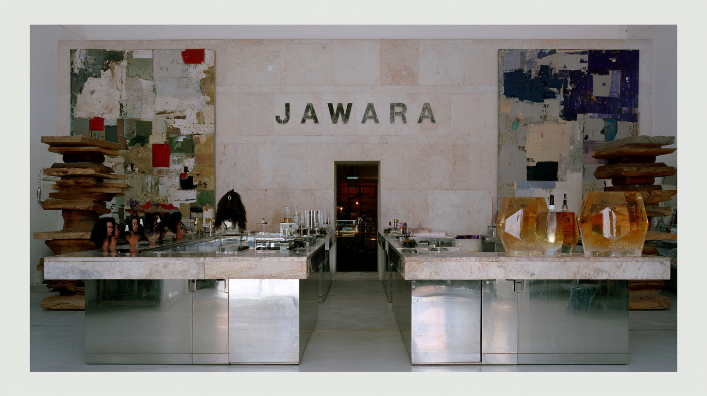
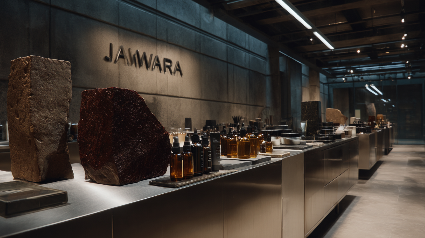
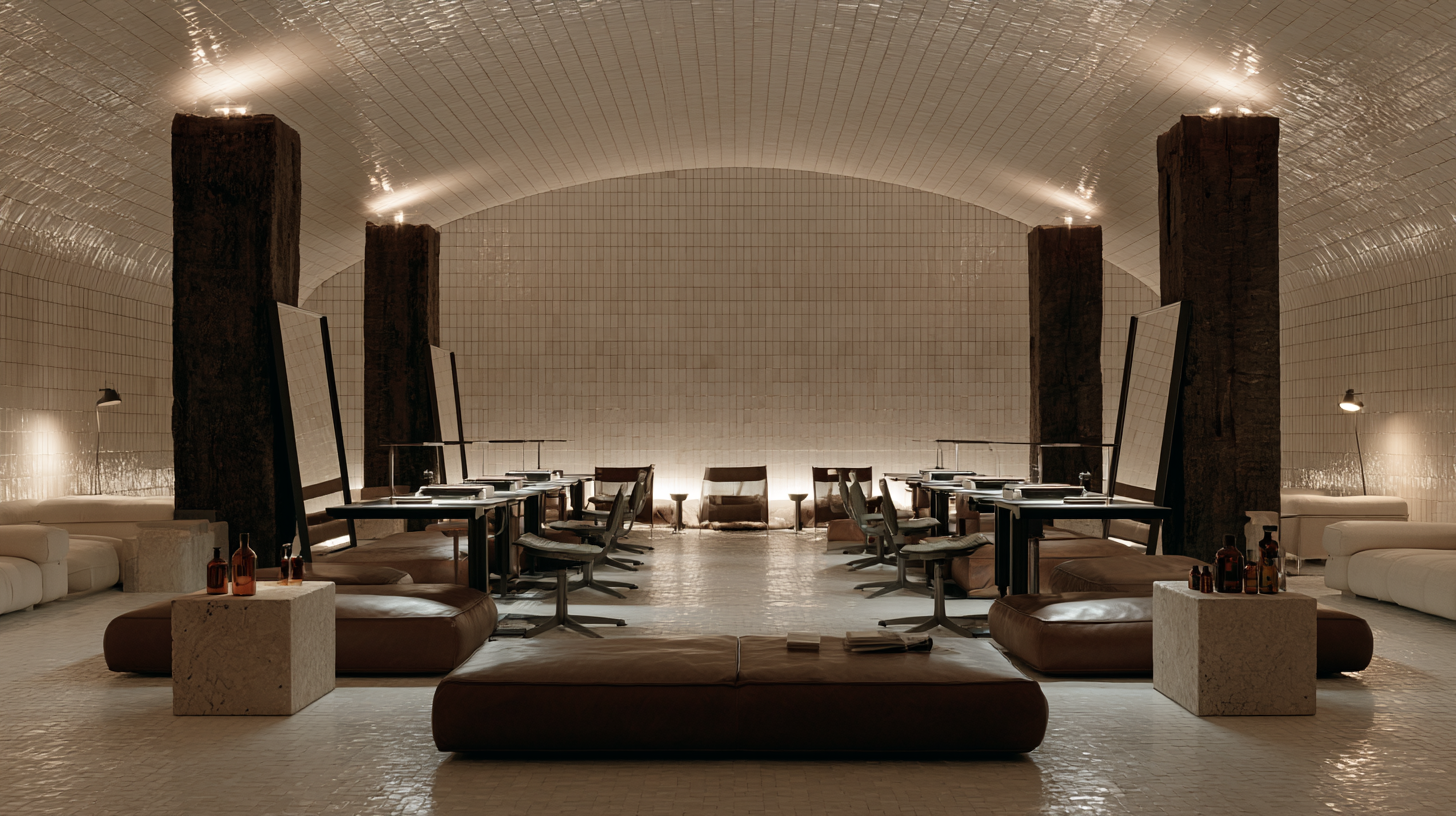
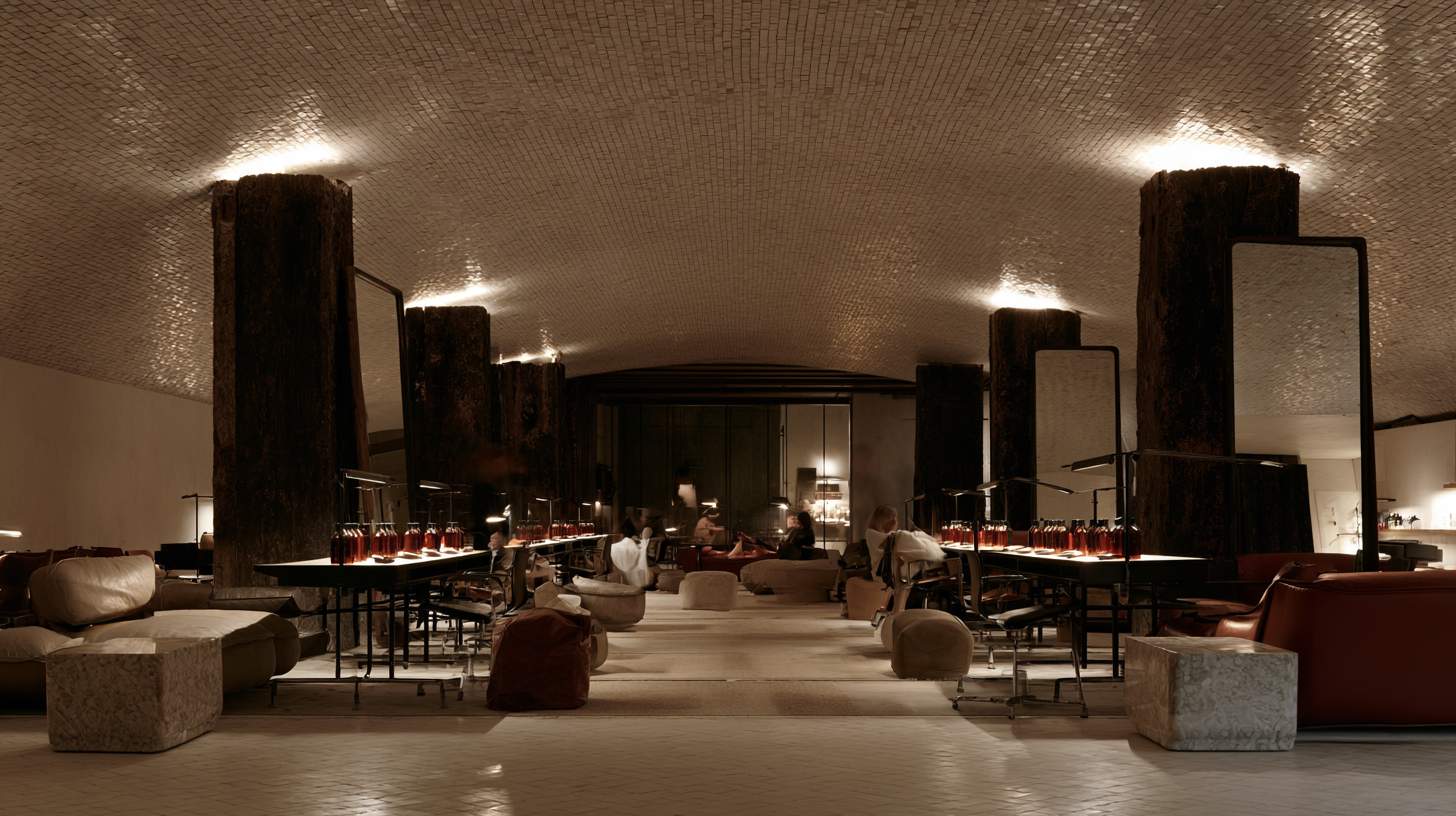
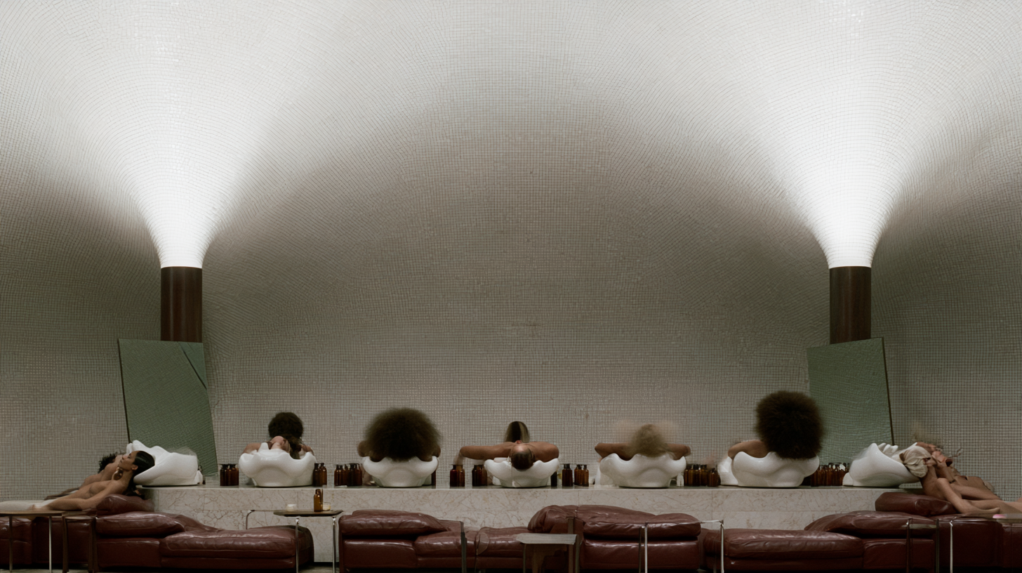
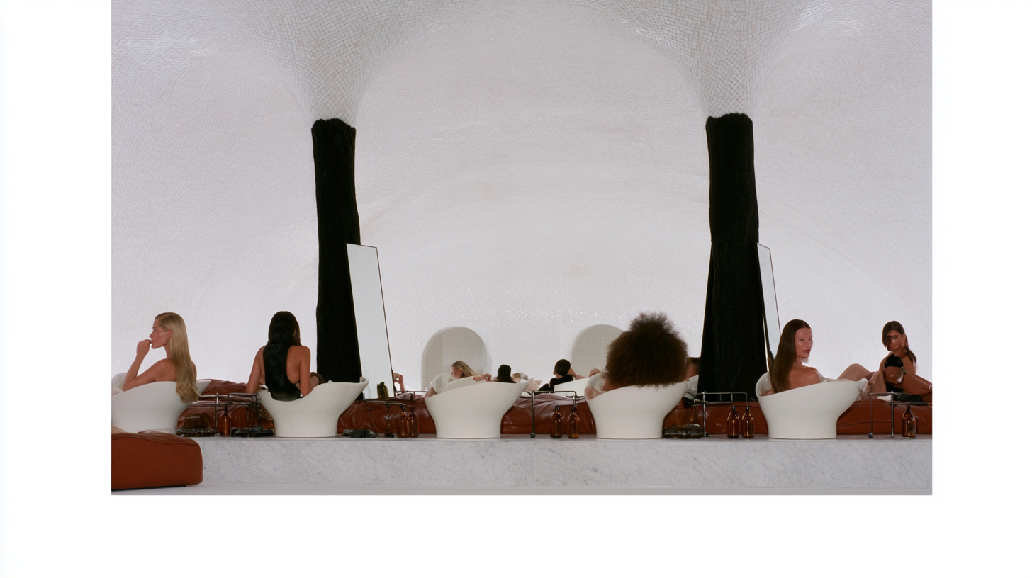
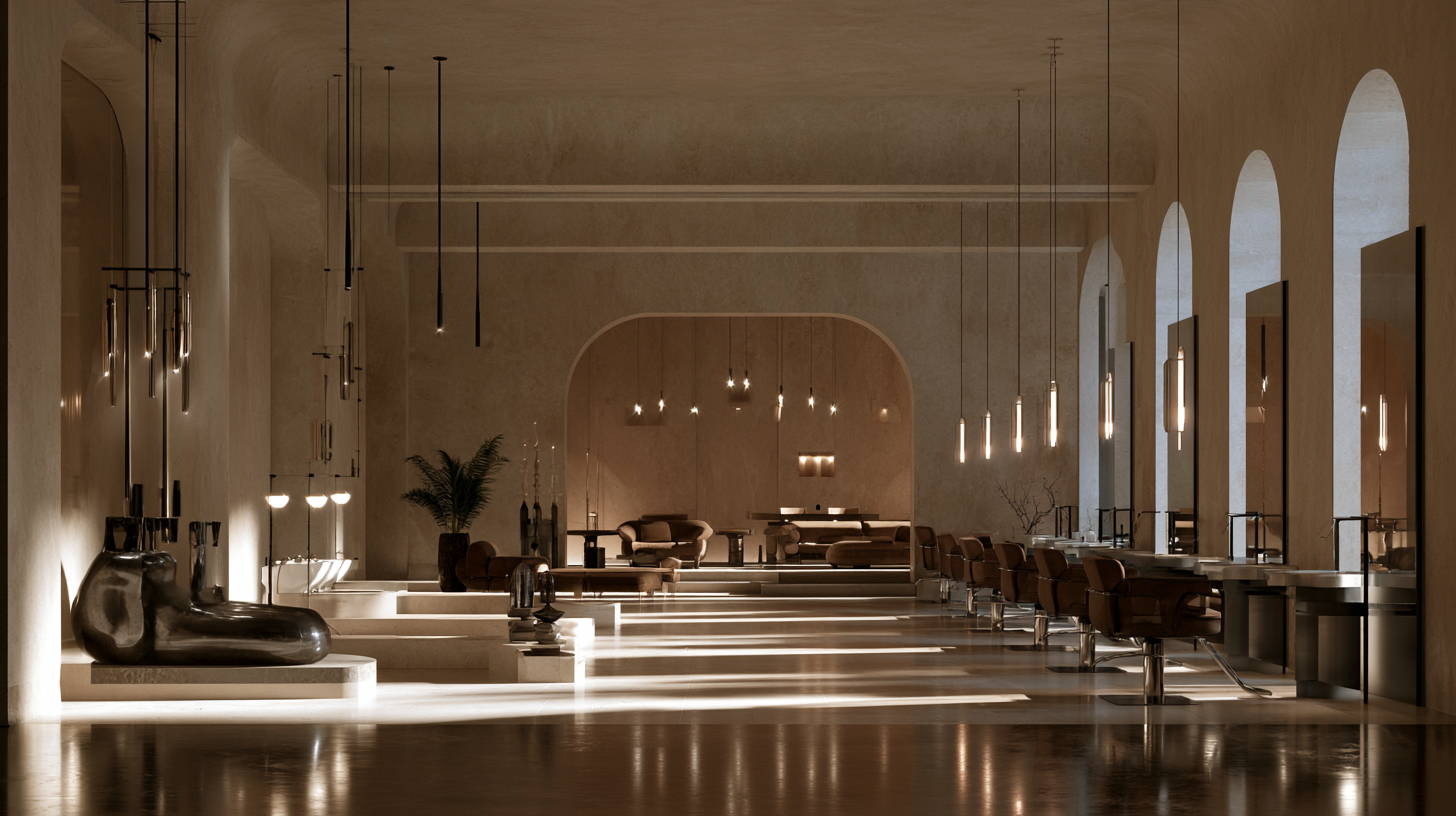
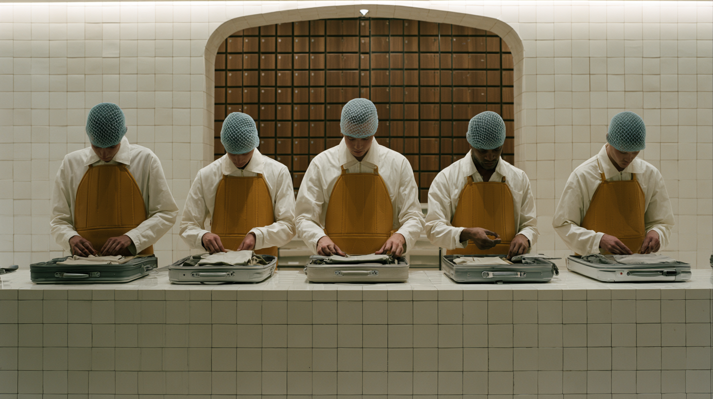
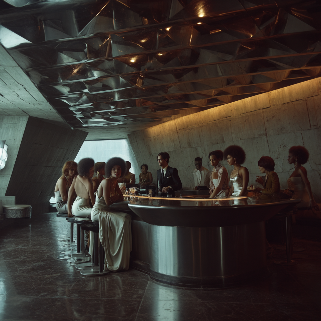
Aesthetically, the project is built around contrast. Monumental pale surfaces—limestone, travertine, tile, plaster, translucent glass—are set against dark timber, blackened metal, tobacco leather, amber liquid, and polished chrome. The resulting spaces feel simultaneously ancient and futuristic, ceremonial and clinical, sensual and severe. Vaulted ceilings, thickened walls, oversized columns, deep niches, and carved apertures give the architecture a sense of permanence and mass, while reflective surfaces, glass vessels, and precise lighting introduce an almost laboratory-like clarity.
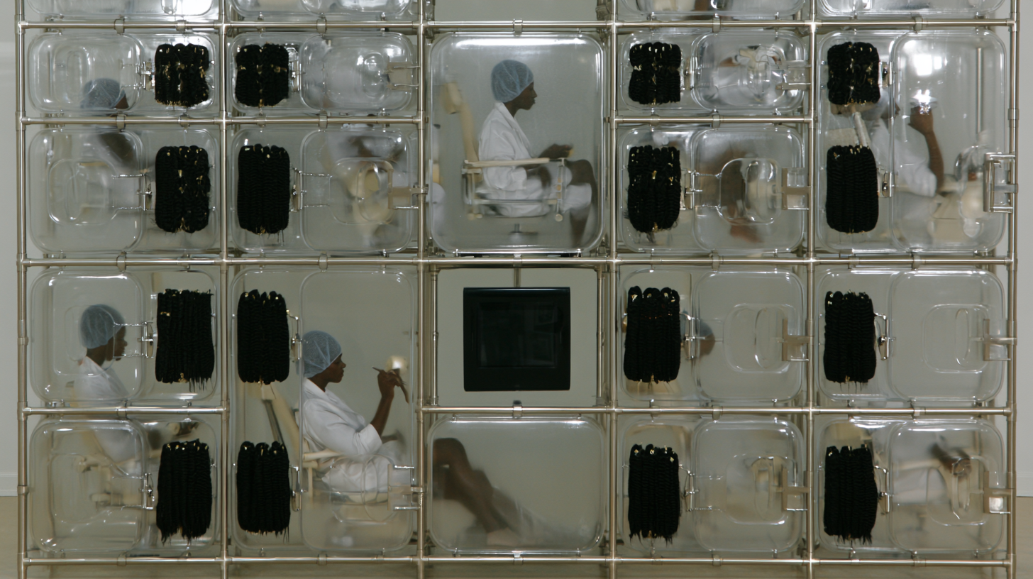
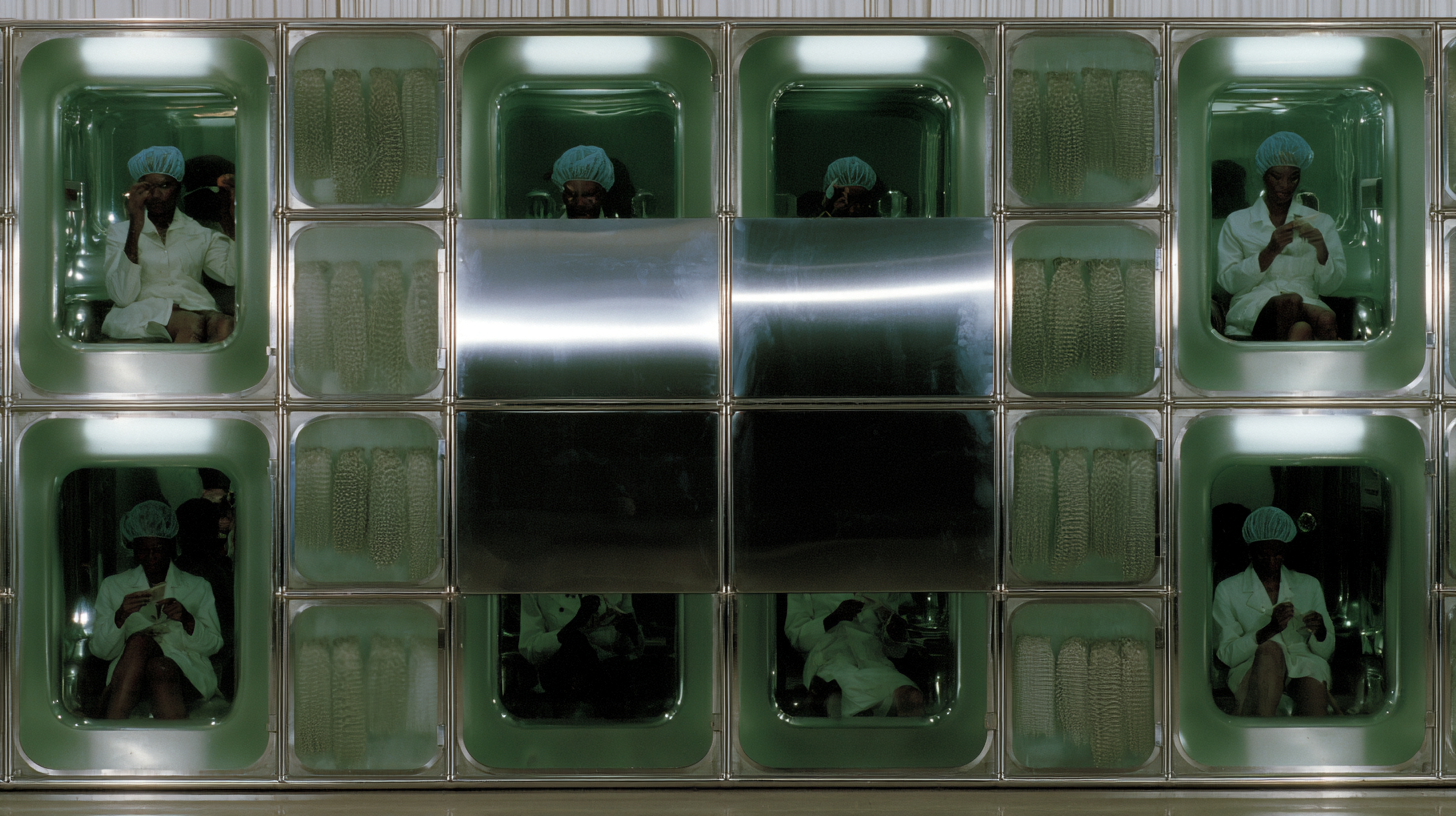
The salon program is intentionally deconstructed. Conventional styling stations, shampoo areas, waiting rooms, retail fixtures, and treatment zones are reimagined as social and architectural typologies. Chairs become lounge furniture. Basins become sculptural objects. Mirrors become freestanding planes and portals. Waiting areas become conversation landscapes. Product is displayed as still life rather than merchandise. Service is framed less as transaction than as ritual.
Across the concept studies, the project repeatedly moves between the domestic, the institutional, and the theatrical. Some spaces recall a private members’ club; others feel like a bathhouse, fashion atelier, archive, laboratory, or gallery. These references are not literal. They are used to expand the emotional range of the beauty environment and to give everyday acts of grooming a greater sense of ceremony, dignity, and cultural weight.
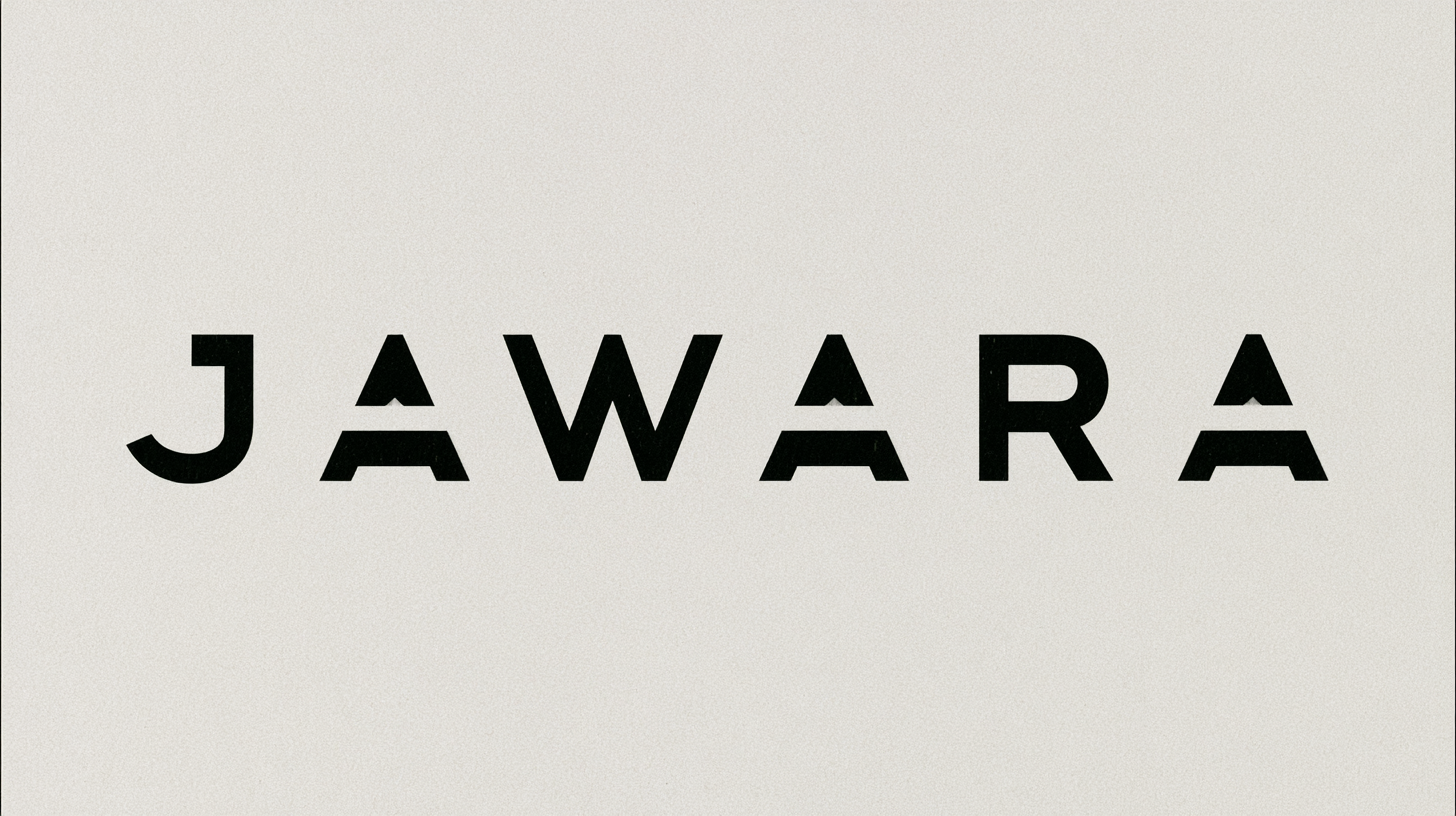
The packaging follows the same logic at object scale. Bottles and vessels are designed to feel architectural: thick glass, faceted forms, metallic caps, mineral finishes, amber liquids, and restrained typography. Rather than competing visually with the interiors, the products inhabit the same material world. The brand identity is deliberately quiet, allowing form, proportion, texture, and composition to carry much of the expression.
The final creative language is one of controlled tension: rough and refined, intimate and monumental, functional and symbolic. The project does not rely on decorative codes traditionally associated with beauty retail. Instead, it proposes a more elemental language of mass, light, surface, reflection, ritual, and repetition.
At its core, the concept reimagines personal care as a form of spatial culture—an environment where architecture, fashion, beauty, hospitality, and product design converge into a single, highly authored world.